How do you speak to Gen Z without mimicking them? You build a brand that feels part of their world—without trying to belong to it.
Visual Identity for Two Gen Z-First Soft Drinks
Client: Birra La Dama
Year: 2025
That was the challenge behind this project: two non-alcoholic drinks designed from scratch to stand out on shelf, live across digital platforms, and create instant connection with a hyper-aware, hyper-visual audience.
Positioning & Concept
Design System
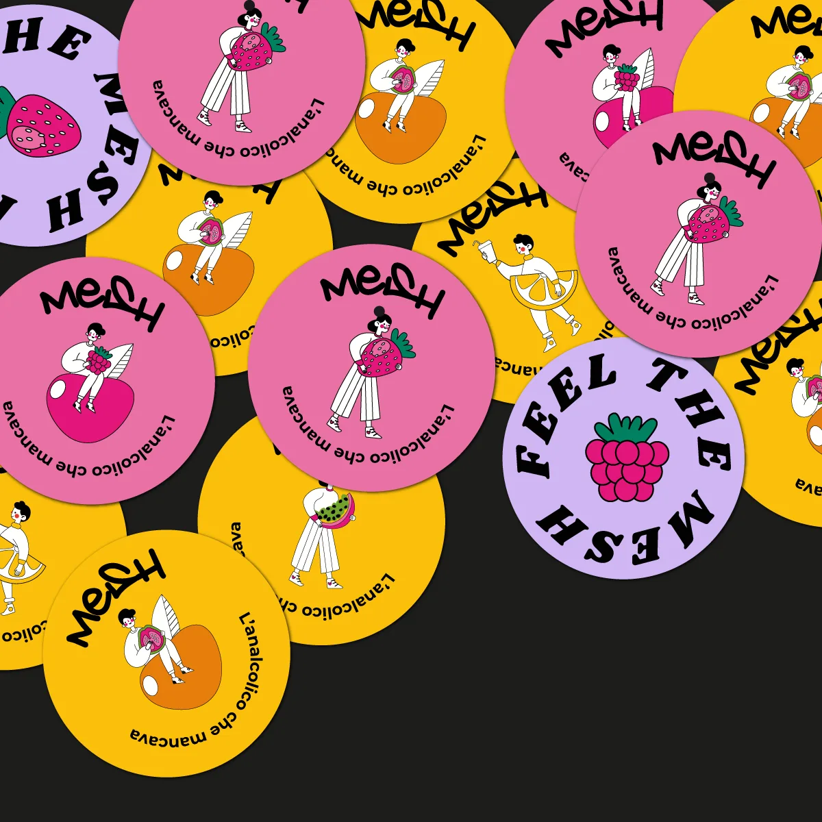
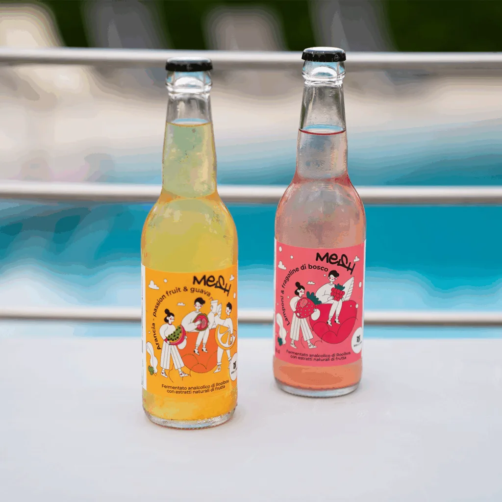
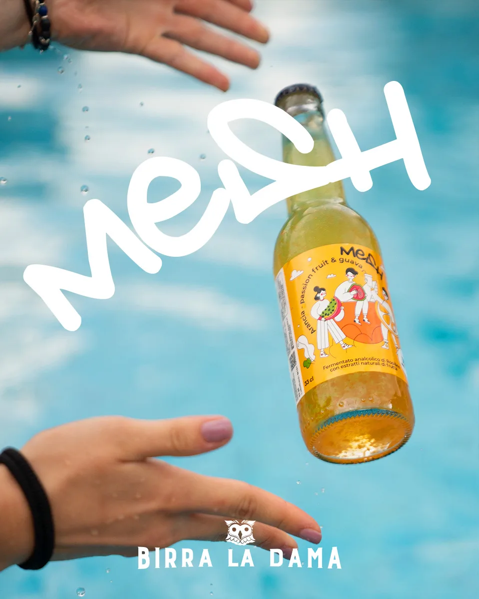
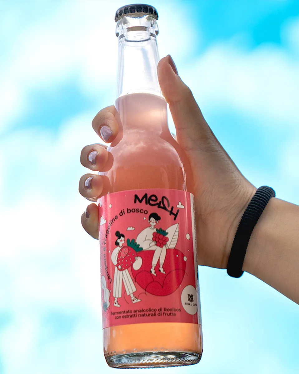
Custom logotype – The name is handwritten like a street tag: raw, fast, expressive. It acts less like a conventional logo and more like a signature left behind on a wall.
Character-led illustration – Each drink features a stylized, illustrated character. They’re not mascots—they’re part of the world. Designed to extend off-pack: stickers, pins, GIFs, merch.
Color and composition – High-contrast palettes, neon accents, layered textures. Everything feels tactile and slightly chaotic—just enough to hold attention, without losing clarity.
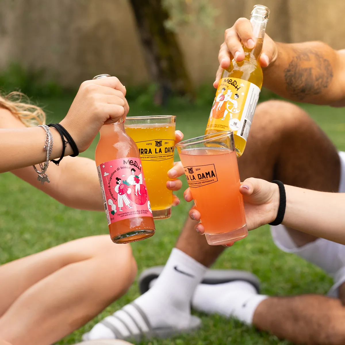
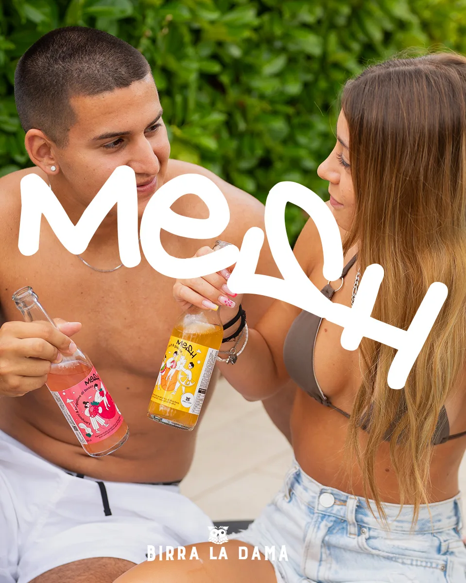
Beyond the Label
From day one, the labels were designed as launchpads. The characters, type, and visual codes are made to stretch—into content, collabs, limited drops, AR filters, or even vending machines.
It’s a system that’s designed to move—with culture, not behind it.
Impact
Bold but not loud. Strategic without being overbuilt.
And above all: made for people who don’t want to blend in—even in front of the fridge.